Writing Software for Novelists Who Don't Write in English
Most book-writing tools are built for English and give you a Latin serif whatever language you type. Galley picks the typeface from your book's language: Amiri for Arabic, Nastaliq for Urdu, Frank Ruhl Libre for Hebrew, Shippori Mincho for Japanese, and so on across 54 languages. A face that cannot render your script is never in the dropdown. Language support is a work in progress, rolling out in phases: Arabic and Persian first, then Hebrew, then the rest of the non-Latin scripts, with Japanese and Chinese last.
Search for book writing software and every result assumes you write in English. The templates are English. The examples are English. Most of them will let you type Arabic or Japanese into the editor, because the browser does that for free, and then hand you a PDF where your book is set in a serif drawn for the Latin alphabet and your own script comes out as empty boxes.
This is the list of languages Galley serves, the face each script is set in, and what happens to it when it gets typeset.
Why Galley supports more than English
A novelist writing in Bengali is doing the same job as one writing in English. A tool that mangles the book at the last step has decided who it is for.
Self-publishing is not an Anglophone activity either. Arabic, Hindi, Bengali, Japanese and Chinese have more readers between them than English. The tools never caught up, so those writers are in Word, in InDesign, or paying a typesetter for something software should do.
There is a practical reason too. Galley has a side-by-side translation view, original on the left, your translation on the right. That is worth nothing if the translation cannot be printed.
What the language setting actually does
Every book in Galley carries one language, set on its metadata page. It is not decoration. It does four jobs:
- Spellcheck. Your prose is checked against your own browser’s dictionary, so any language works if you have the dictionary installed. Galley never uploads your text to check it.
- The EPUB tag. The language is written into the EPUB so a reading device knows what it is holding. This matters more than it sounds for CJK, and there is a section on that below.
- Hyphenation. 35 of the 54 languages carry hyphenation patterns, used only when you justify the print PDF. Justification is off by default.
- The typeface shelf. This is the important one. Your language decides which book faces you are offered, and a face that cannot render your script never appears in the dropdown.
That last point is the difference between a tool that tolerates your language and one that sets it. Picking a beautiful Garamond for a Hindi novel and finding out at export time is a bad afternoon. It is easier to remove the wrong answers than to warn about them.
Why these faces and not the ones you have heard of
Every face in Galley is under the SIL Open Font License, and that is not a stylistic preference. It is the only licence that lets the software do its job.
When Galley makes your print PDF it embeds the font inside the file. Same with the EPUB. That is redistribution, and most of the type the publishing trade actually sets books in does not permit it without a separate licence, usually priced per title or per print run. Sabon, Bembo, Minion, Adobe Garamond, Dante, Morisawa’s Ryumin, Founder’s Songti, SM Myeongjo, Noori Nastaliq. Those are the faces the industry uses, and every one of them would put a licensing bill between you and your own book.
So the rule for the shelf is two things at once: licensed for you to sell the book, and the face a novel in that language is actually set in. Where the classic is not available, Galley ships the closest honest revival or a face in the same tradition, and each section below says which one and what it descends from. Where the gap is real, it says that too.
Write your book in English
English gets the widest shelf: fifteen faces, every one cut for long-form reading rather than for a screen. Five are marked Recommended. They are the safe choices for a novel and you will not go wrong with any of them.
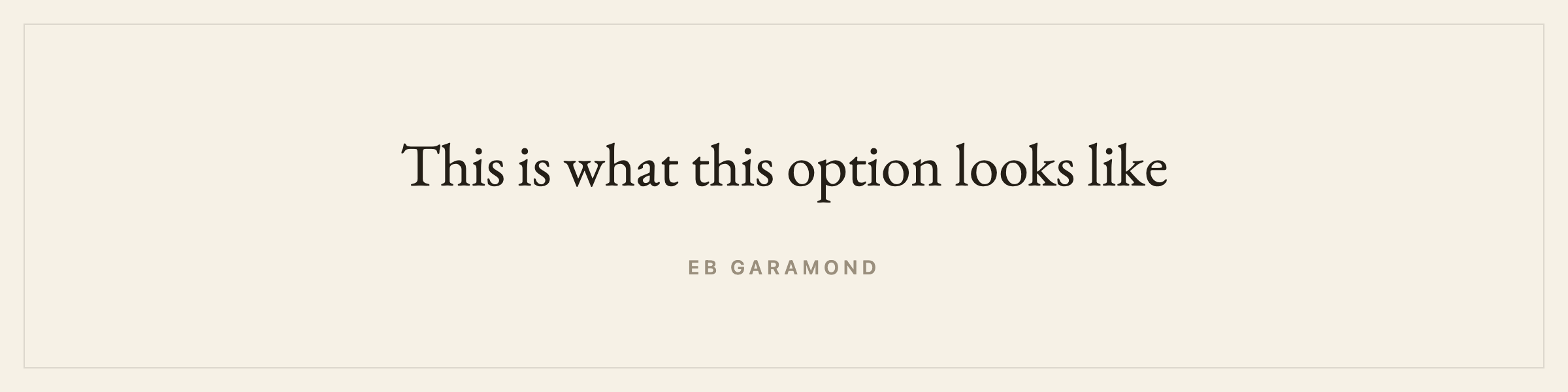
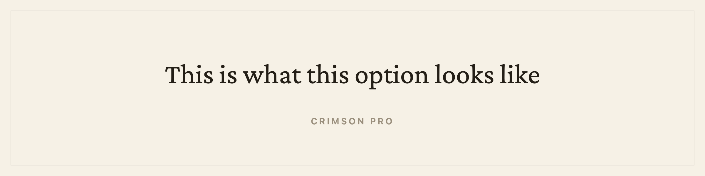
Most are revivals of the faces English-language novels have been set in for centuries. EB Garamond is Claude Garamond by way of the Egenolff-Berner specimen, and Garamond is the most-set face in English trade fiction. Libre Baskerville is Baskerville. Libre Caslon Text is Caslon. Cardo follows Bembo. Crimson Pro sits in the same oldstyle tradition as Minion. Source Serif 4 comes out of Fournier. Literata was drawn for Google Play Books and Newsreader and Spectral for long-form reading. Alegreya was designed specifically for literature. Charis SIL descends from Bitstream Charter.
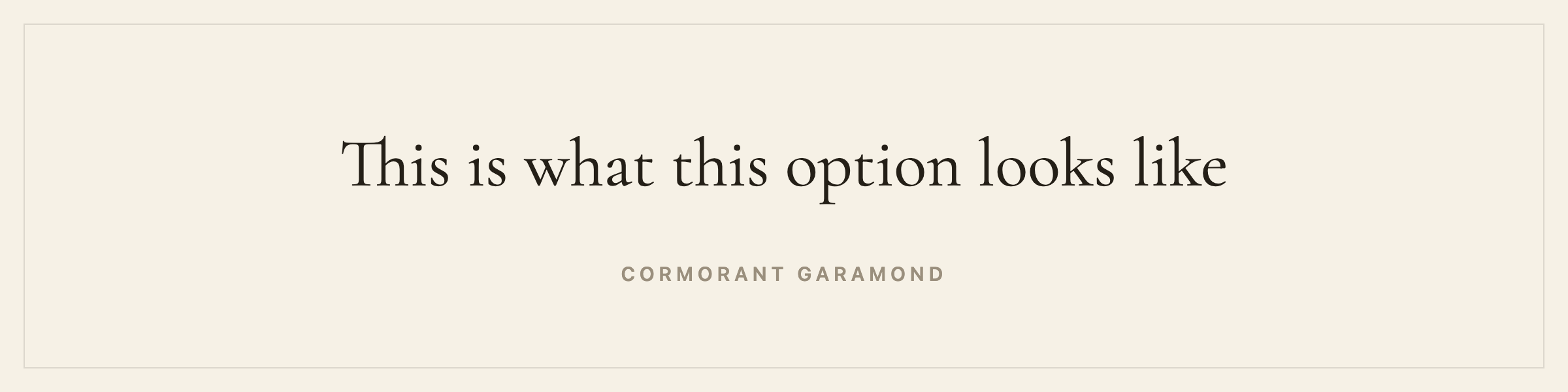
Recommended: EB Garamond, Crimson Pro, Cormorant, Lora, Libre Baskerville.
There is a fuller page on book writing software for a novel in English, covering house style, trim sizes and where an English book gets sold.
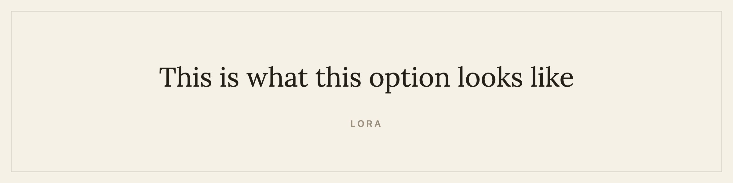
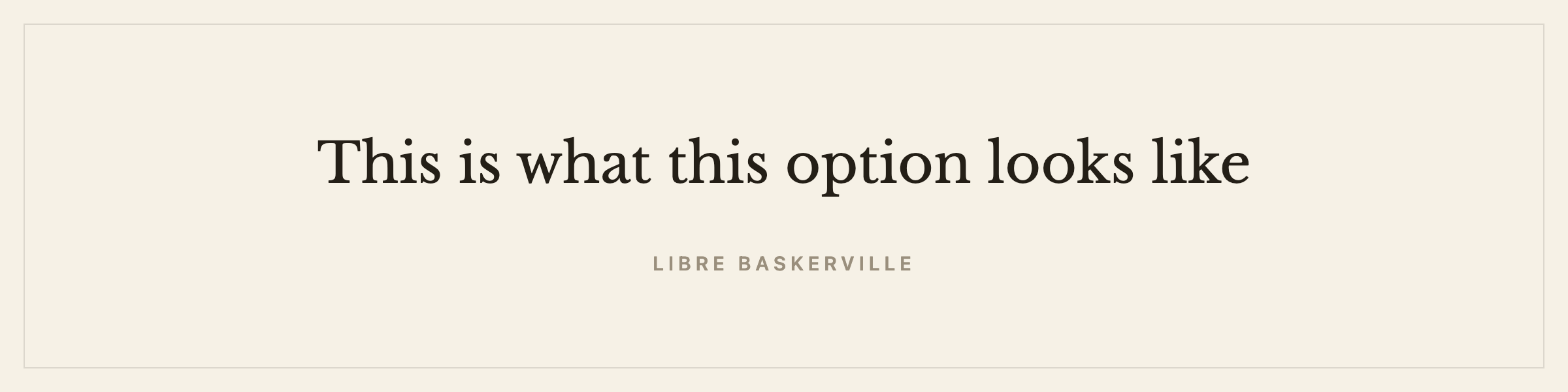
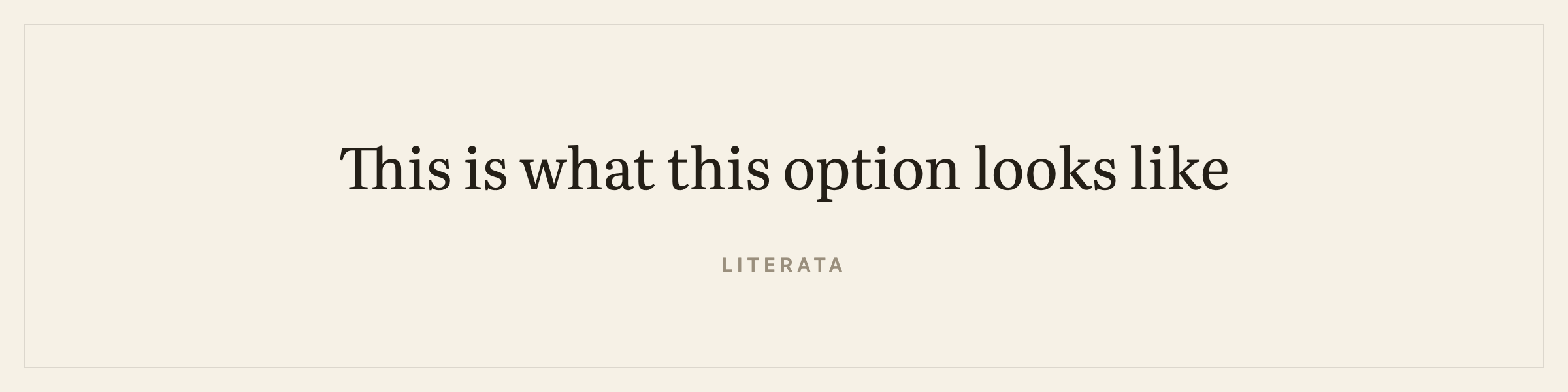
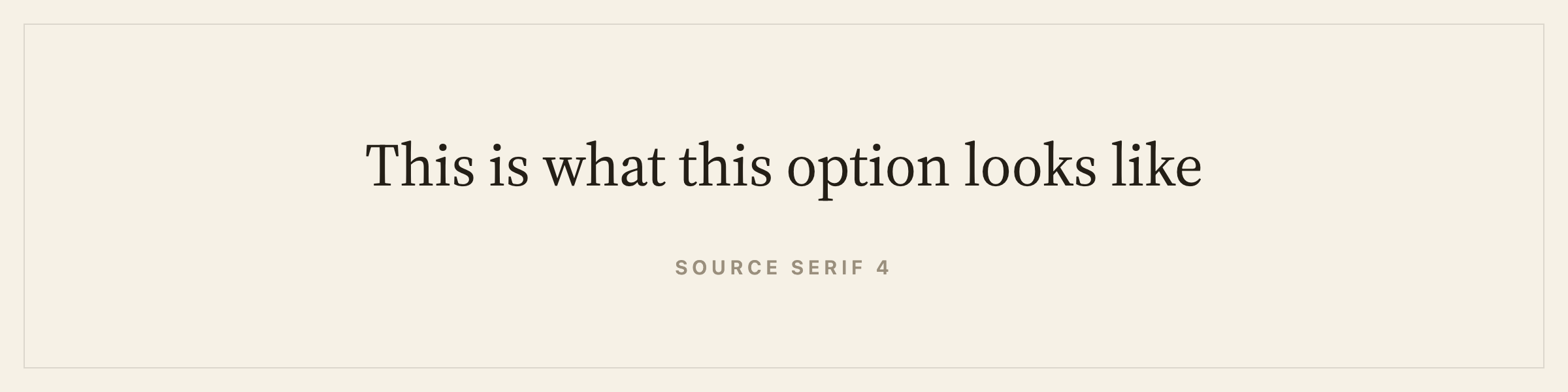
The rest of the shelf: Literata, Source Serif 4, Spectral, Alegreya, Vollkorn, Cardo, Gentium Book Plus, Newsreader, Libre Caslon Text, Charis SIL.
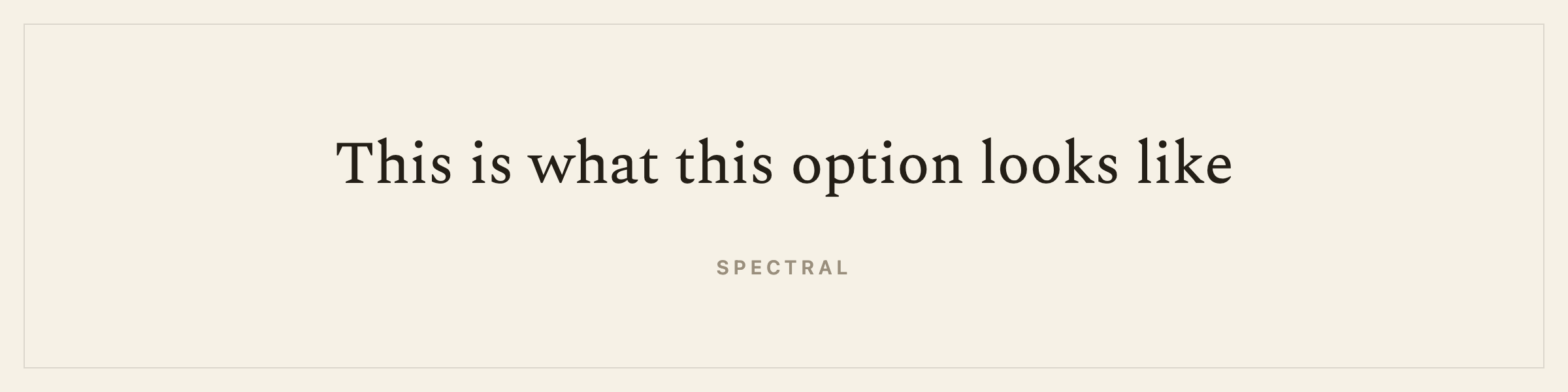
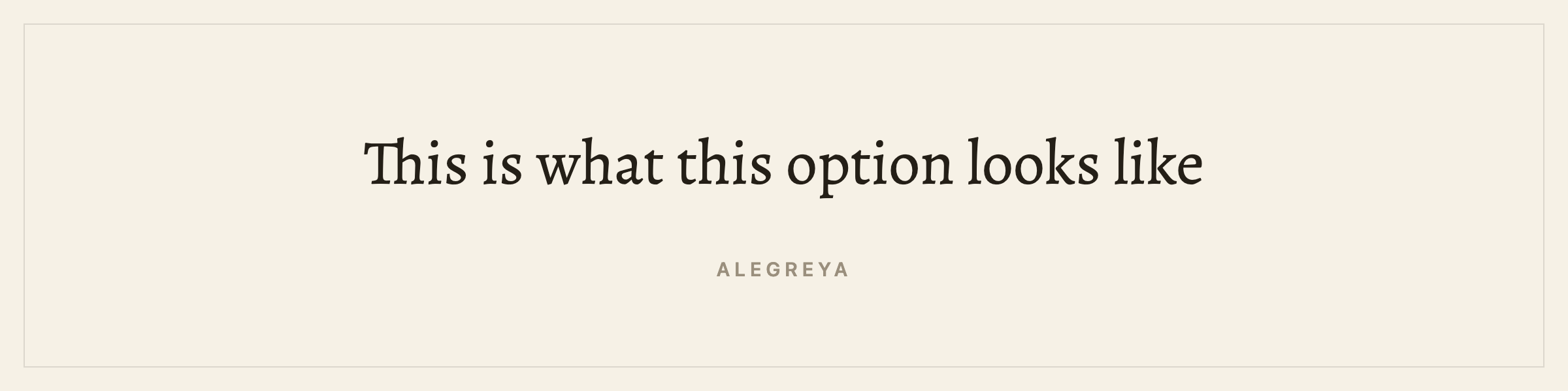
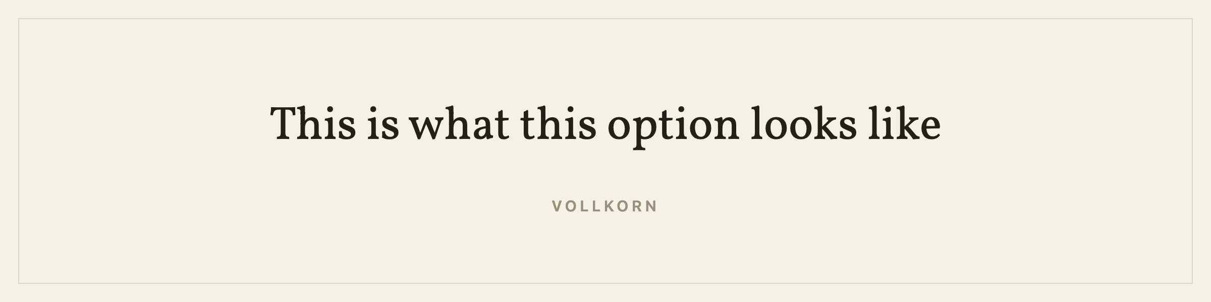
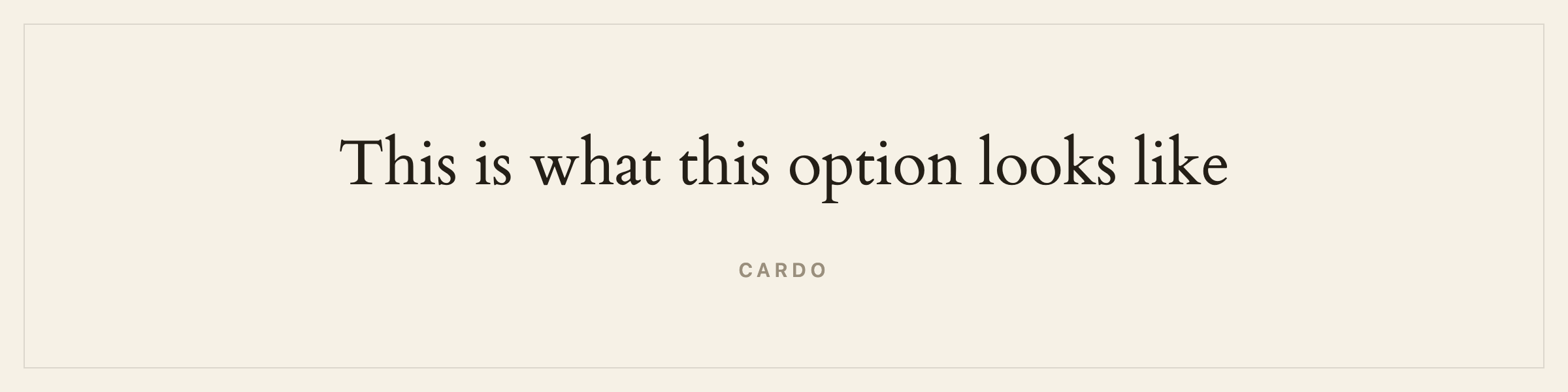
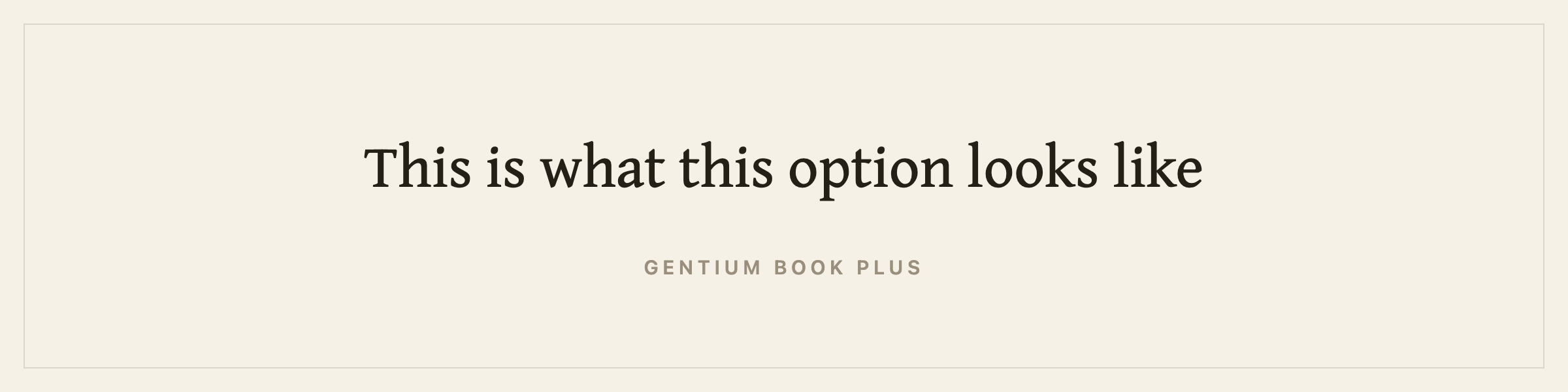
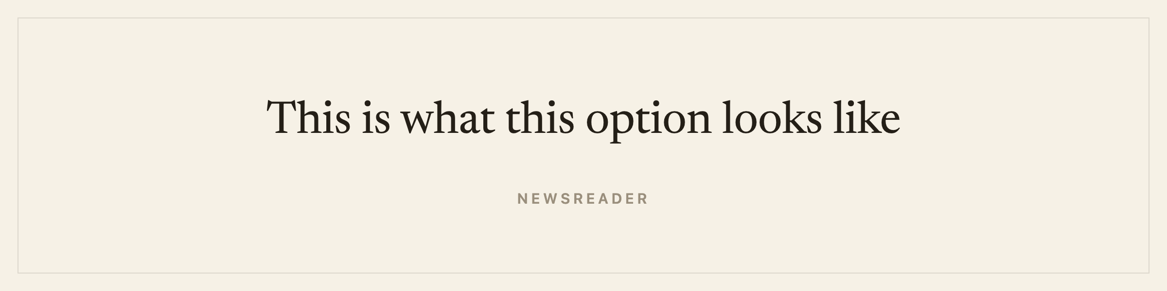
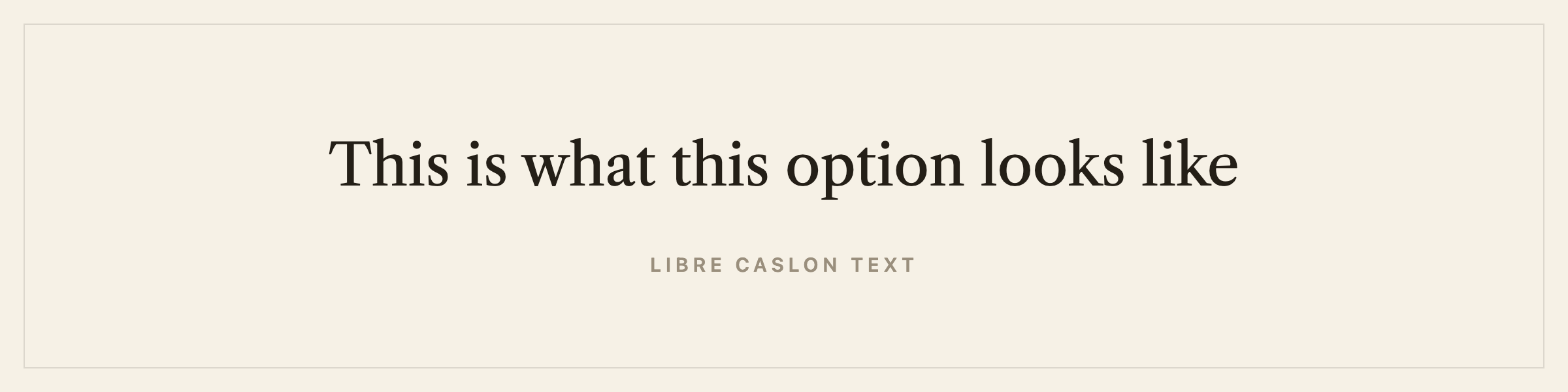
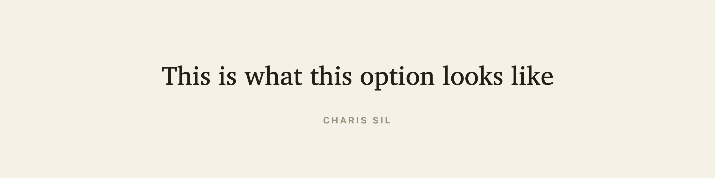
All fifteen carry a real italic and a real bold, drawn rather than slanted or stroked on. That is worth checking in any tool: a faked italic is visible on a printed page even when nobody can say why.
What you will not find here: Sabon, Bembo, Minion, Adobe Garamond, Granjon, Dante, Janson Text, Electra, Palatino. These are the faces a London or New York production department would reach for, and all of them are proprietary. Setting your book in Sabon means licensing Sabon. The revivals above are the closest you can get and still own the file you sell.
One caveat I will make in public: Cormorant is a display face. It is beautiful at a chapter opening and light for a whole novel at body size. It is on the shelf because people ask for it. Set a sample page before committing to it.
Ten of them also set Cyrillic, seven set Greek and twelve set Vietnamese, which is what the next few sections are about.
Write your book in Arabic
Arabic is cursive. Every letter takes a different shape depending on what sits beside it, four shapes for most letters, and the text runs right to left. It is the hardest script in this list to typeset and the one with the strongest typographic tradition to live up to.
The faces: Amiri, Noto Naskh Arabic, Scheherazade New.
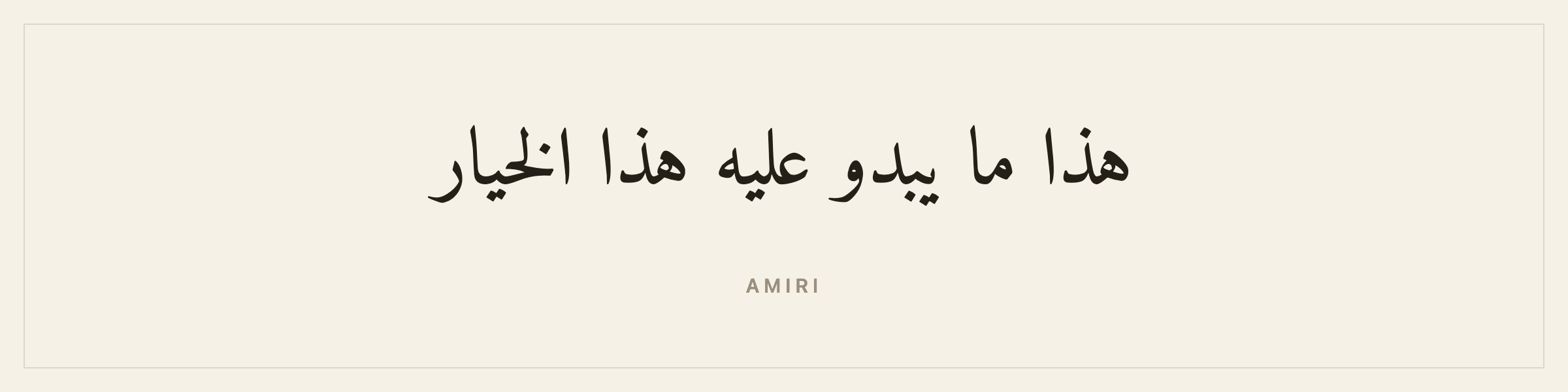
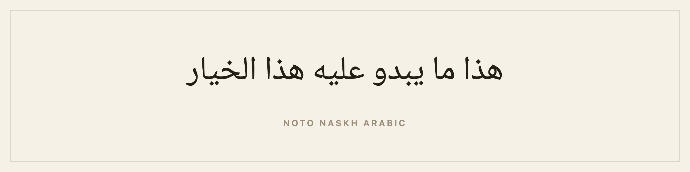
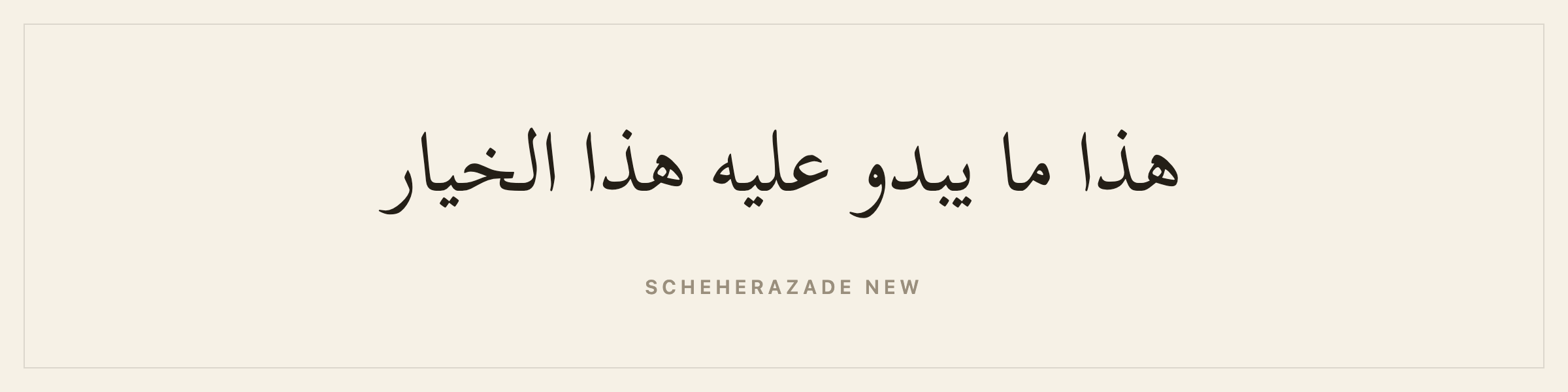
Amiri is the literary choice. It is modelled on the type cut for the Bulaq Press in nineteenth-century Cairo, and it is what an Arabic novel is supposed to look like. Noto Naskh Arabic is the safe default with the broadest glyph coverage. Scheherazade New, from SIL, reaches furthest into the languages that borrow the Arabic script, including Sindhi, Kurdish, Kashmiri and Uyghur.
All three are Naskh, the style Arabic books are set in. None of them has an italic, and that is correct rather than a gap. Arabic has no italic tradition. A slanted Naskh is not emphasis, it is a mistake, so Galley does not offer one.
Arabic justification traditionally uses kashida, elongating the connecting strokes rather than stretching the spaces between words. Galley does not do kashida. Set your Arabic book ragged right, which is also what most contemporary Arabic publishers do.
What you will not find here: DecoType Naskh, Monotype Naskh, Linotype’s Simplified Arabic, the Boutros families. Arabic is the one script where the gap barely matters, because Amiri is a revival of a genuine press face rather than a substitute for one.
Write your book in Persian (Farsi)
Persian uses the Arabic script with four extra letters, پ چ ژ گ, and its own digit forms. It is not a dialect of Arabic and it is not typeset identically, but it rides the same machinery.
The faces: Markazi Text, Amiri, Noto Naskh Arabic, Scheherazade New.
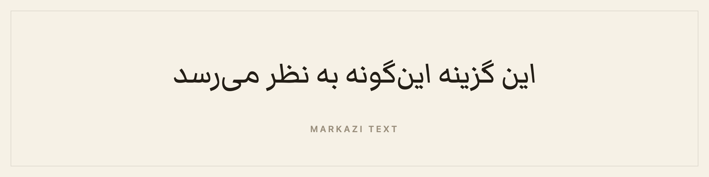
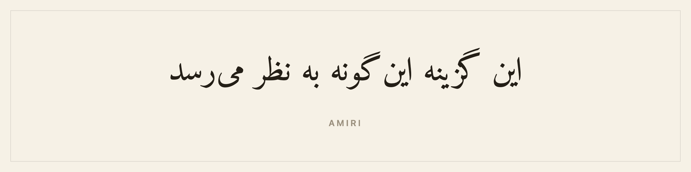
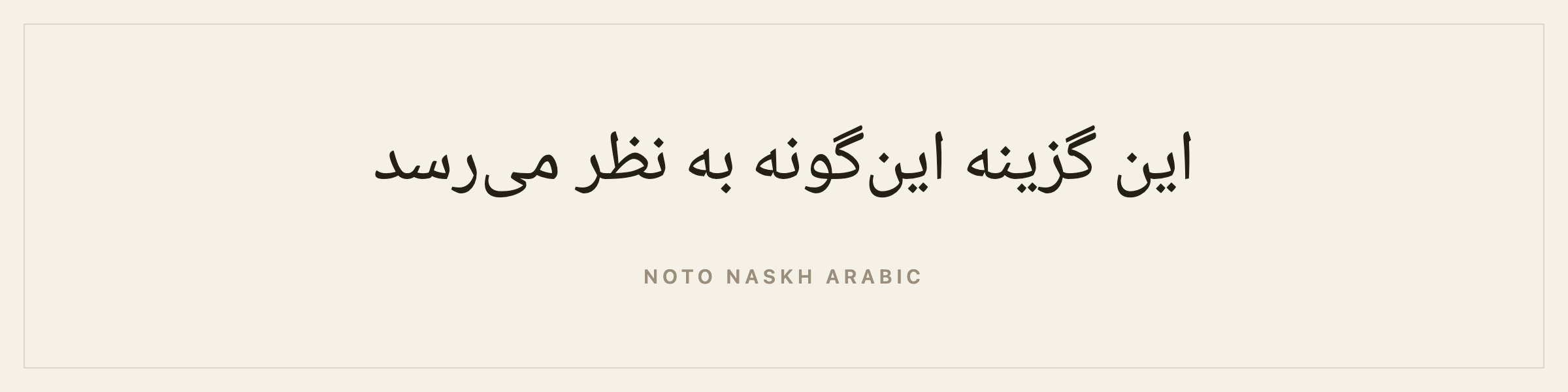
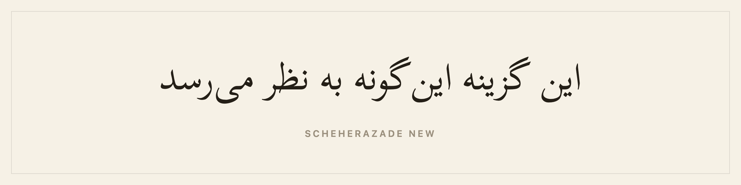
Markazi Text is the one to reach for first. It was drawn for Persian by a Persian type designer, where the other three are Arabic faces that happen to cover Persian as well. There is a fuller page on book writing software for a novel in Persian, covering direction, the half-space, punctuation and publishing.
What you will not find here: Nazanin, Lotus, Mitra, Yagut. Nazanin in particular is the face a Persian reader has seen their whole life, and it is licensed from Iranian foundries rather than freely. Markazi is the closest available in the same tradition.
Coverage is the thing to check with any of them. A face cut for Arabic alone will not carry the four Persian letters, and a book that loses چ is not a book. All four here carry them, and all four carry the Persian digits, so numbers come out in the forms a Persian reader expects rather than the Arabic-Indic ones.
Write your book in Urdu
Urdu is where a lot of software quietly gets it wrong, and I will be specific about why.
Urdu uses the Arabic script, so the temptation is to hand it an Arabic face and move on. Urdu readers expect Nastaliq, a style where the words cascade diagonally down and to the left, with letterforms that change size and slope through a word. Setting an Urdu novel in Naskh does not read as a stylistic choice. It reads as wrong, roughly the way an English novel set entirely in Comic Sans reads as wrong.
The faces: Noto Nastaliq Urdu, Gulzar.
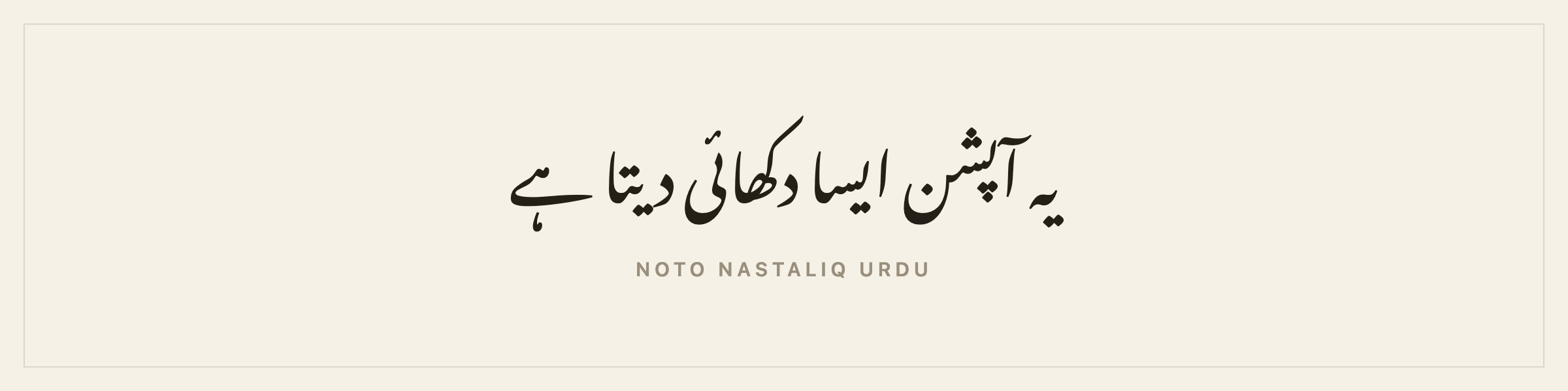
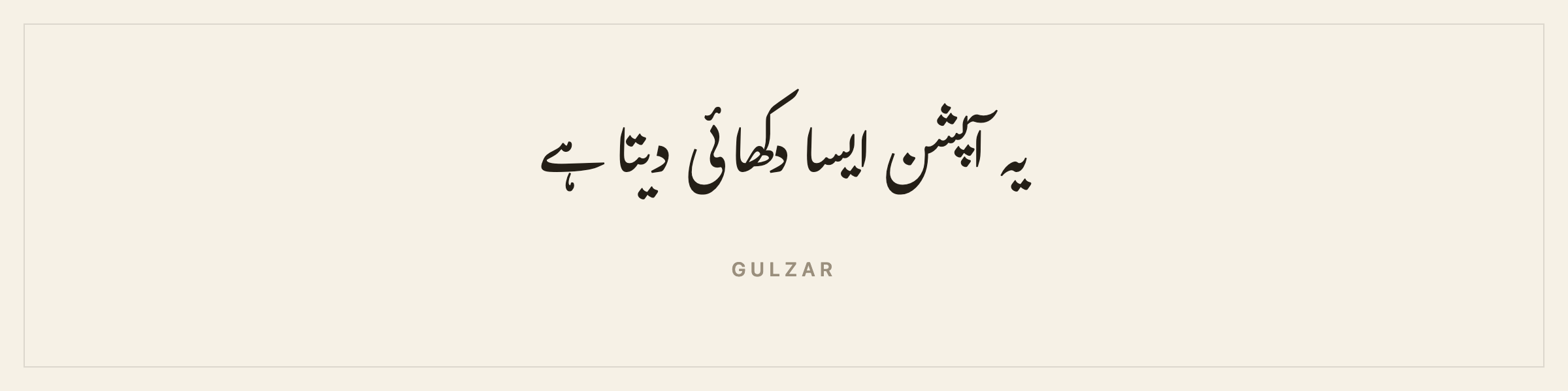
Noto Nastaliq Urdu is the reliable one and it ships a bold. Gulzar is the better Nastaliq by most eyes, and it publishes no bold weight at all, so bold text in a Gulzar book gets a synthetic stroke rather than a real cut. That trade is yours to make, which is why both are on the shelf.
Nastaliq is unusually demanding on a layout engine. Line heights have to be generous or the descending words collide. If you set an Urdu book, give it more leading than you think it needs.
What you will not find here: Noori Nastaliq, and this is the widest gap on the whole shelf. Noori Nastaliq is what Urdu publishing runs on, it is what sits inside InPage on every Urdu desk, and it is Monotype’s. There is no OFL equivalent of it. Noto Nastaliq Urdu and Gulzar are the best free Nastaliq that exists, and an Urdu typesetter will know the difference.
Write your book in Hebrew
Hebrew runs right to left and is not cursive, which makes it the technically simplest of the right-to-left scripts. Letters keep their shape. Ordering is the whole problem, and ordering is a solved problem in the browser.
The faces: Frank Ruhl Libre, David Libre.
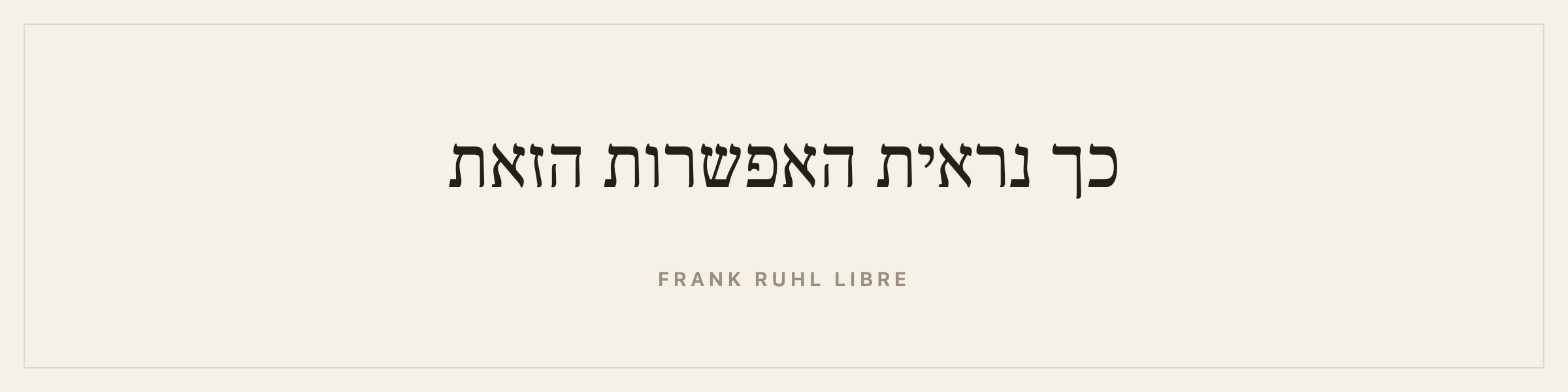
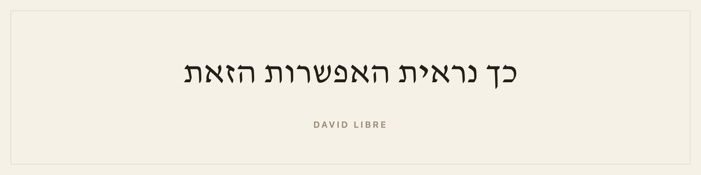
Frank Ruhl is the classic Hebrew book serif, cut in 1908 and still what most Hebrew literary publishing looks like. David Libre is the other classic and reads slightly warmer.
Neither has an italic. Hebrew emphasis is conventionally done with letterspacing or with a different weight.
What you will not find here: Hadassah, Narkis Block, Narkis Tam. Hadassah is the other great Hebrew book face and is licensed rather than free. Hebrew is lucky, though: Frank-Rühl is the standard and a faithful open version of it exists, which is not true for most scripts on this page.
One quirk worth knowing: a Hebrew novel almost always contains Latin somewhere, a name, an ISBN, a year. Both faces carry Latin alongside the Hebrew, so those runs are set in the same face rather than falling back to something else.
Write your book in Hindi
Devanagari hangs its letters from a horizontal line, the shirorekha, running along the top of every word. Vowels attach above, below, before and after the consonant they modify, and consonant clusters form conjuncts that are their own shapes. It renders beautifully and it punishes a font with thin coverage.
The faces: Noto Serif Devanagari, Tiro Devanagari Hindi.
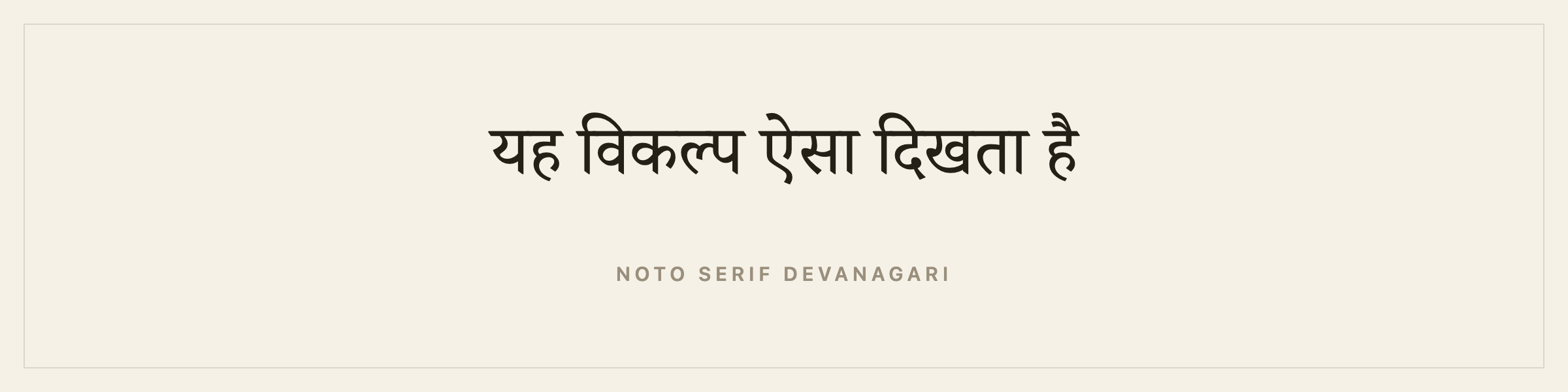
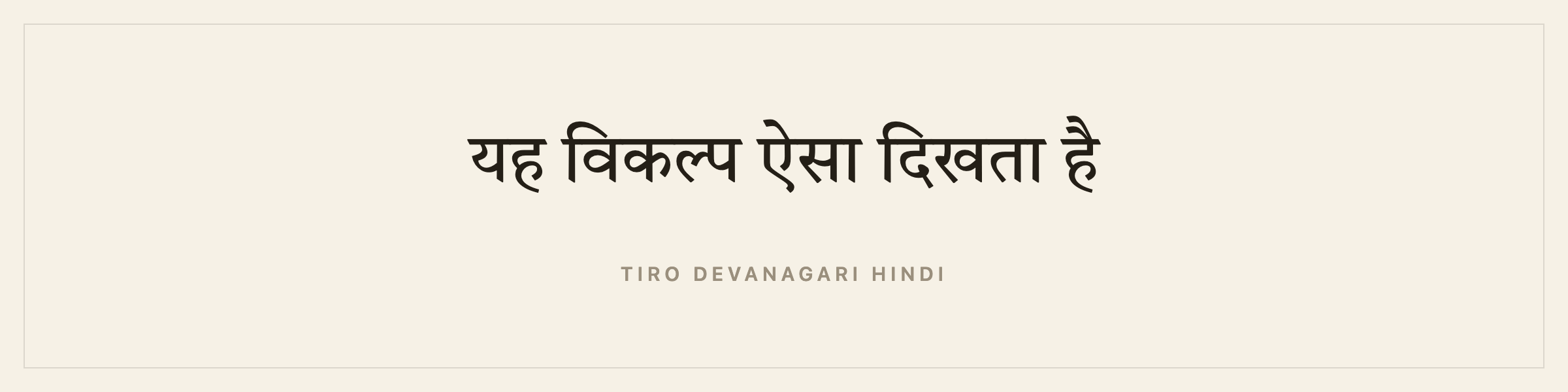
Noto Serif Devanagari is the broad, careful default. Tiro Devanagari Hindi was drawn by John Hudson for long-form Hindi text, which is exactly what a novel is. It replaced Martel, which is a good face and is not a book face.
There is no italic in either, and Devanagari has no italic tradition to draw on.
What you will not find here: Shree Lipi, Kruti Dev, Linotype Devanagari, Monotype Devanagari. Indian trade publishing largely runs on Shree Lipi and on legacy Kruti Dev files, neither of which is licensable for embedding, and Kruti Dev is not even Unicode.
A warning that applies to any tool, not only this one: never let software strip diacritics from Devanagari. Removing a matra does not produce an accent-insensitive version of a word, it produces a different word. If a search box in any writing app finds मत when you typed माता, it is not being helpful.
Write your book in Bengali
Bengali shares Devanagari’s structure, the headline and the stacked vowel signs, with its own letterforms and a much larger set of conjuncts. It is the language of an enormous literary tradition and it is badly served by writing software.
The faces: Noto Serif Bengali, Tiro Bangla.
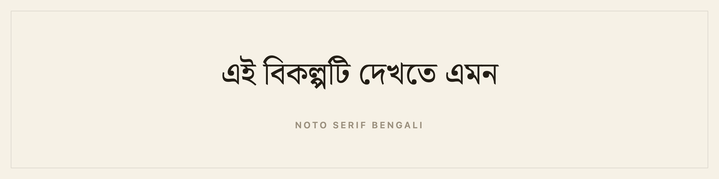
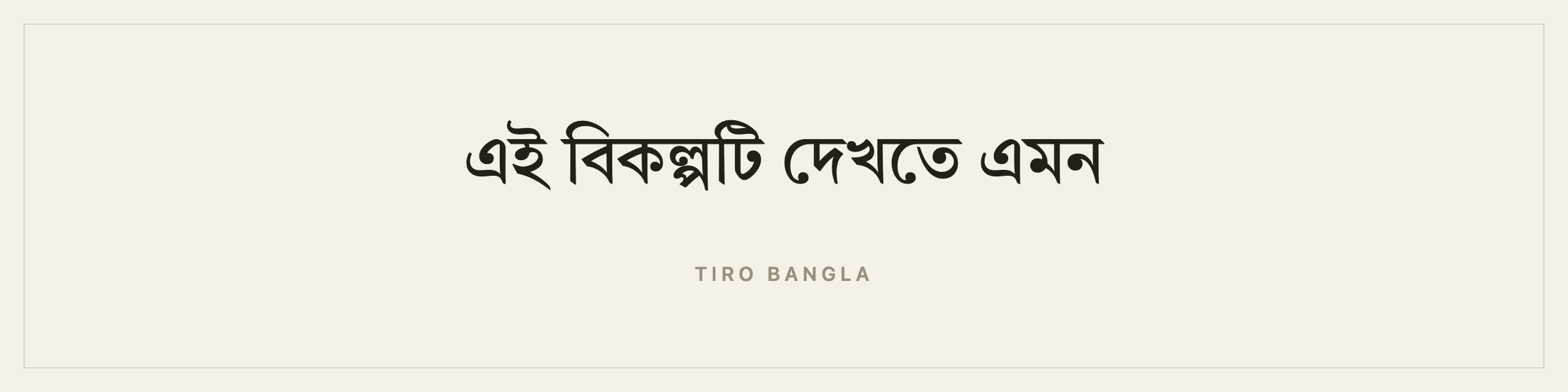
Noto Serif Bengali is the workhorse. Tiro Bangla is the more characterful cut and, unusually for this list, it does have an italic, though it publishes no bold.
The same diacritic warning applies. Bengali matras are letters, not decoration.
What you will not find here: Shree Bangla and the older Lipi and Sulekha families that Kolkata and Dhaka publishing grew up on. Tiro Bangla is the closest thing to a modern book face for Bengali that you are free to sell a book in.
Write your book in Thai
Thai has no spaces between words. Sentences are separated by spaces and words are not, which breaks a surprising amount of software that assumes a space means a word boundary.
The faces: Noto Serif Thai, Taviraj.
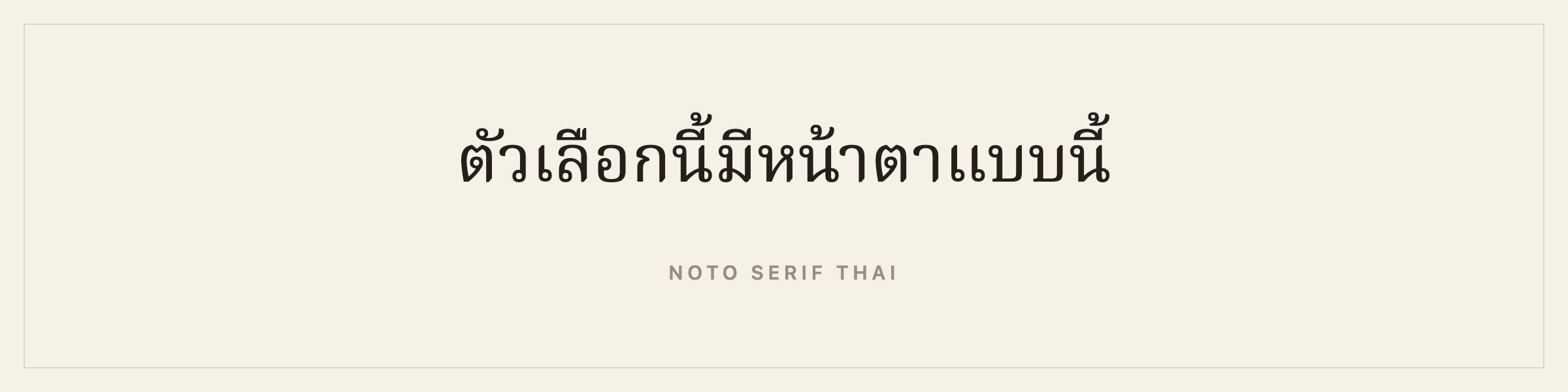
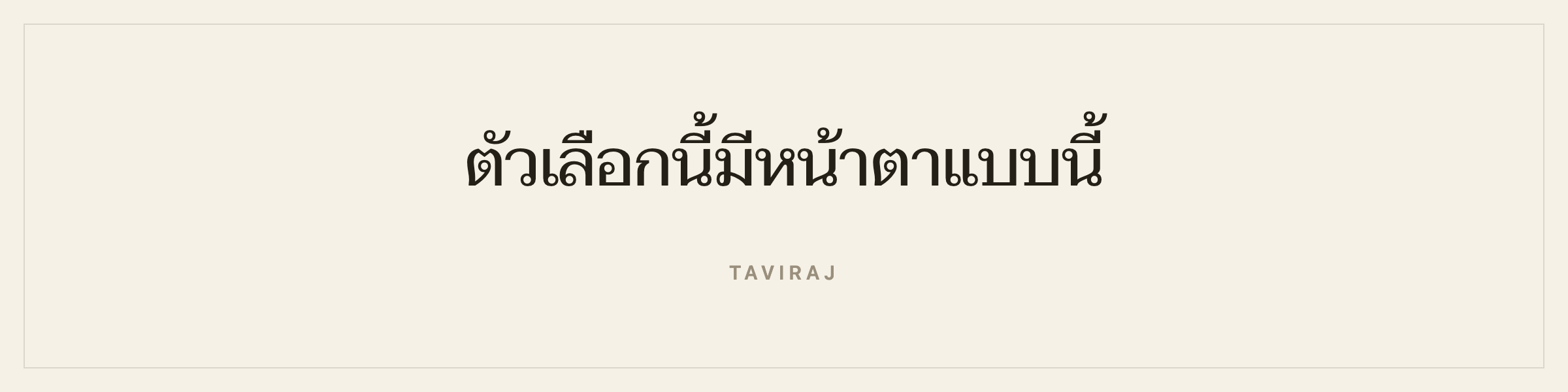
Noto Serif Thai is the book face. Taviraj is a Thai serif with a real Latin companion, drawn for reading at length. It replaced Sarabun, which is a document sans and was the one face on the shelf that novels are not set in.
Thai stacks tone marks and vowel signs above and below the consonant line, so line height matters more than in Latin. And because there are no spaces, working out where a line may break takes a dictionary rather than a rule.
Both faces here are looped (มีหัว), which is the form Thai books are set in. Loopless faces are a modern display style and wrong for a novel.
What you will not find here: Angsana New, AngsanaUPC, Browallia, Cordia, and the DB families. Angsana is what most Thai books are set in and it ships with Microsoft Office under Microsoft’s licence rather than one that lets you embed it in a book you sell.
Write your book in Japanese
Japanese is the most demanding script here, and the most interesting.
The faces: Shippori Mincho, Noto Serif JP.
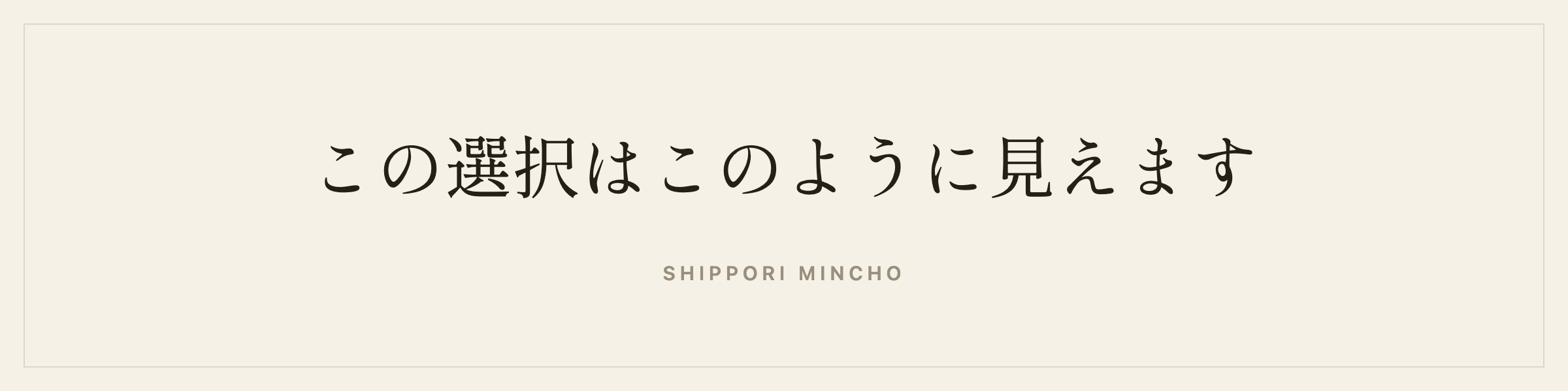
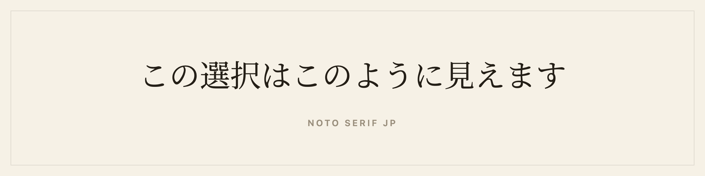
Mincho is the serif category of Japanese type, the equivalent of choosing Garamond over Helvetica for a novel. Shippori Mincho was drawn for print books rather than screens and is the right default. Noto Serif JP is the broader, more neutral alternative.
Three things about Japanese that most software ignores:
Emphasis is not italic. Japanese marks emphasis with bōten, small dots set beside each character. A slanted mincho is not a Japanese design decision, it is a rendering accident. So in a Japanese book Galley replaces the italic button with a bōten button, ⌘I applies bōten, and the dots reach the print PDF, the EPUB and the Word file. Word has carried the mark since 2003, so it survives the handoff to an editor.
Vertical writing is normal. Japanese literary fiction is usually set tategaki: characters run top to bottom, columns run right to left, the book binds on the right, and the pages turn the other way from a Western book. Horizontal is normal for technical books and some genre fiction. Both are correct Japanese and only the author knows which book this is. Galley writes horizontally today, and vertical is on the roadmap.
What the horizontal half does now. Chapter numbers set as 第一章. Line breaks follow kinsoku shori, so a line never opens on 。、」 or a small kana and a full stop that would push a line over hangs in the margin. There is a quarter-em space between Han and a Latin word, which is what a compositor sets. Drop caps are not offered, because a dropped Han character reads as a fault. The trim list gains 新書, 四六判, B6, A5 and 菊判 in millimetres. A Japanese book carries a 奥付 on its last page instead of a copyright page at the front.
One thing to check before you commit to Amazon. KDP sells Japanese as an ebook and a paperback but not as a hardcover, Traditional Chinese as an ebook only, and Simplified Chinese and Korean not at all. Galley says so in the book rather than letting you find out at upload, and every export still works for every other route. The full list is in the publishing docs.
The language tag decides how the characters are drawn. Japanese, Simplified Chinese and Traditional Chinese share code points for many characters that are drawn differently in each. This is Han unification, and it means an EPUB with no language tag can render your Japanese novel in Chinese letterforms on a reader that guesses wrong. Galley writes the language into the EPUB, which is the one line of metadata that stops it.
What you will not find here: Ryumin, Iwata Mincho, Hiragino Mincho. Ryumin is Morisawa’s and is the face a Japanese novel is set in, more or less by default. Japanese type is licensed by subscription and per use, which is exactly what an embedded font cannot be. Shippori Mincho was drawn for printed books and is a genuine book mincho, so the tradition is right even though the specific face is not the one a Tokyo publisher would use.
The W3C’s Requirements for Japanese Text Layout is the reference document if you want to know how deep this goes. It is long for a reason.
Write your book in Chinese
Chinese is two shelves, not one, and conflating them is the most common mistake.
Simplified Chinese: Noto Serif SC. Traditional Chinese: Noto Serif TC.
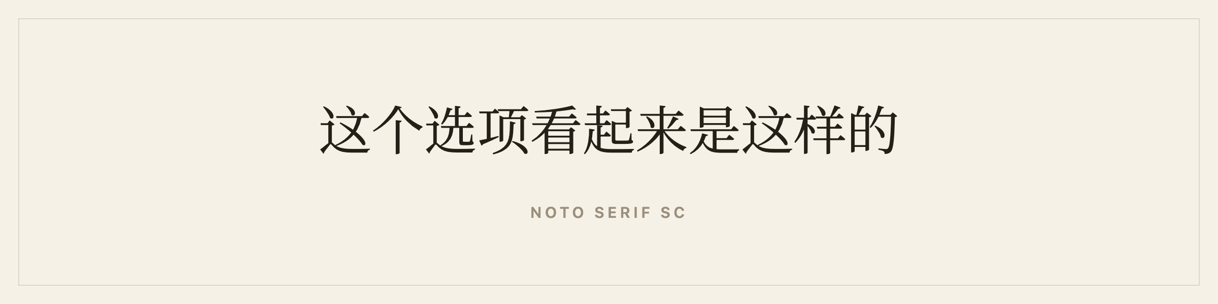
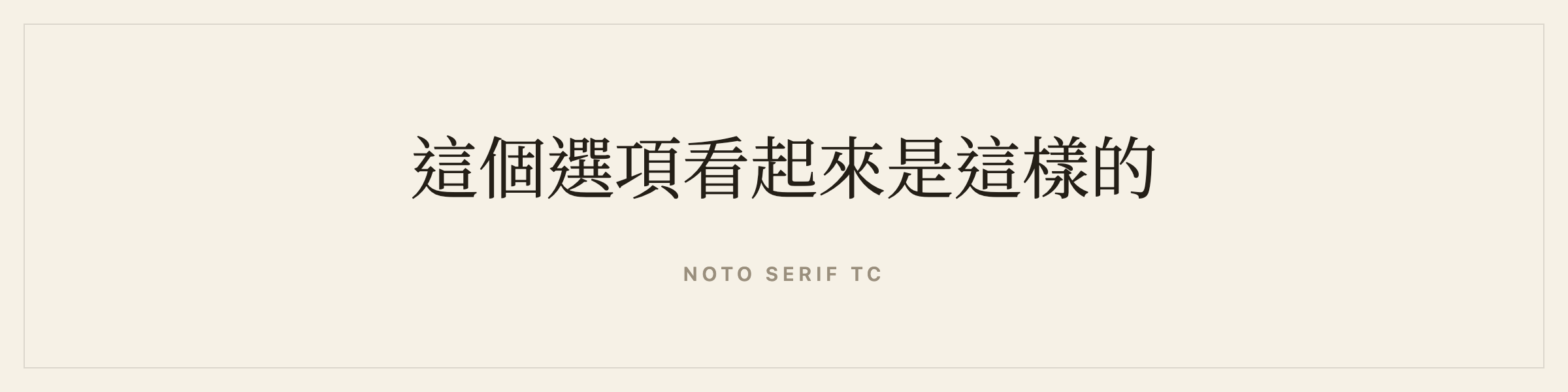
Simplified and Traditional are read by different people and drawn with different characters. One language setting cannot pick a face for both, so Galley lists them separately. Set your book to the one you actually wrote.
Song or Ming style is the Chinese book convention, the equivalent of a serif, and both Noto Serif faces are in it.
Chinese has no spaces between words, no italic tradition, and its own line-break prohibition rules about which punctuation may not begin or end a line. Vertical setting is still current in Taiwan and Hong Kong for literary work and has been uncommon on the mainland since the 1950s. As with Japanese, Galley sets horizontally today.
What you will not find here: Founder’s Songti and Shusong (方正书宋), Hanyi, and Arphic’s traditional families. Founder is what mainland book publishing sets in. A Chinese typeface carries tens of thousands of drawn characters, which is why they are expensive and why the free ones are nearly all Google’s.
The W3C’s Requirements for Chinese Text Layout covers the typographic detail properly.
Write your book in Korean
The faces: Nanum Myeongjo, Noto Serif KR.
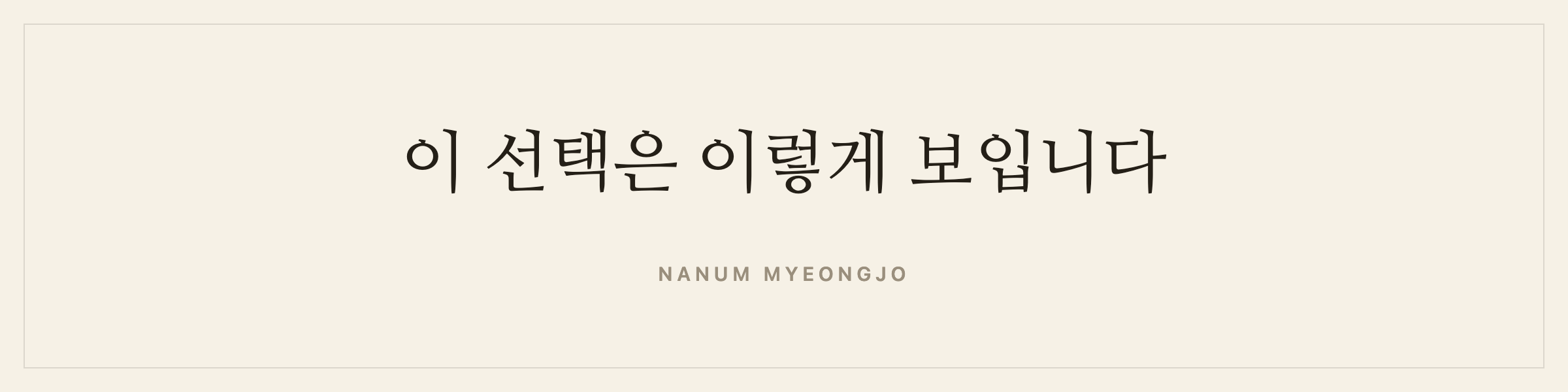
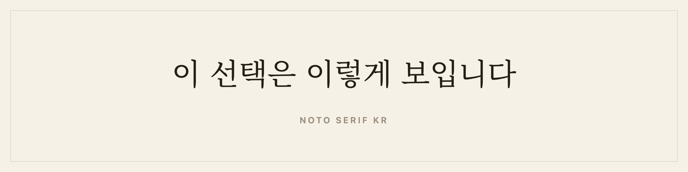
Myeongjo is the Korean serif category and Nanum Myeongjo is the standard book choice. Noto Serif KR is the broader alternative and a much larger file.
Hangul is alphabetic but composes into syllable blocks, so it behaves like a syllabary on the page. Korean does use spaces between words, which makes line breaking far easier than Chinese or Japanese. Modern Korean is written horizontally, left to right. Vertical Korean exists but reads as archaic or deliberately poetic.
Korean has no italic tradition either.
What you will not find here: SM Myeongjo, Sandoll Myeongjo, Yoon Myeongjo. SM Myeongjo is the Korean publishing standard. Nanum Myeongjo is in the same category and is used in printed Korean books, so this is one of the smaller gaps.
Write your book in Russian, Ukrainian, Bulgarian or Serbian
Cyrillic needs no new fonts at all, which makes it the quietest win on this list. Ten of Galley’s fifteen Latin book faces already carry a full Cyrillic alphabet: Alegreya, Charis SIL, Cormorant, EB Garamond, Gentium Book Plus, Literata, Lora, Source Serif 4, Spectral and Vollkorn. Three of them:
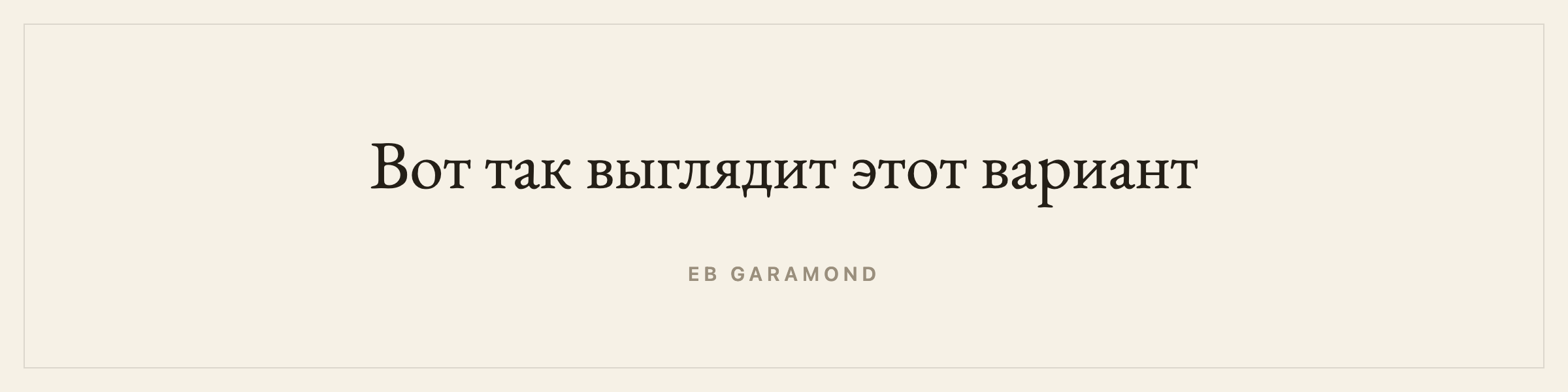
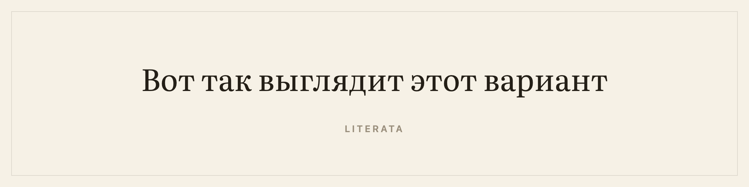
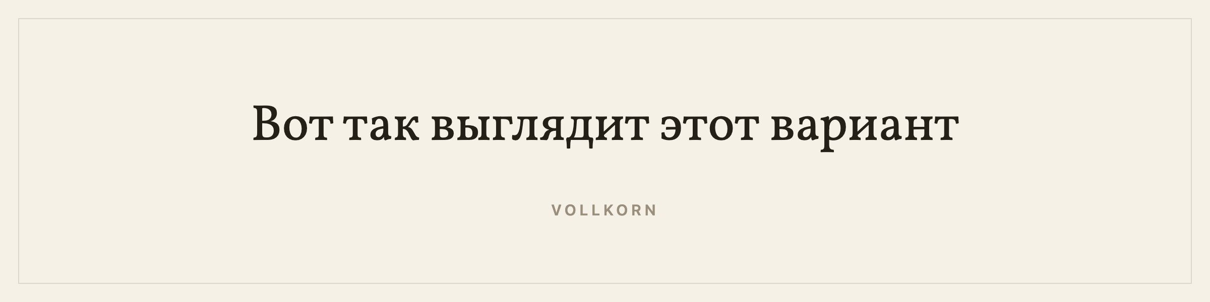
The other five do not, and this is exactly the trap the language filter exists to close. Libre Baskerville is a lovely face and it cannot render a single word of Russian. Before the shelf was filtered by language, a Russian novelist could pick it and find out at export.
Cyrillic keeps its italics, so emphasis works normally. There is a fuller page on book writing software for a novel in Russian, including the fact that Amazon does not publish in Russian at all.
What you will not find here: Literaturnaya and Akademicheskaya, the two faces Soviet and Russian book publishing was built on. Both are ParaType’s.
Write your book in Greek
Seven faces carry a real Greek alphabet: Alegreya, Cardo, EB Garamond, Gentium Book Plus, Literata, Source Serif 4 and Vollkorn. Cardo in particular was drawn for classical scholarship and has the polytonic coverage to prove it.
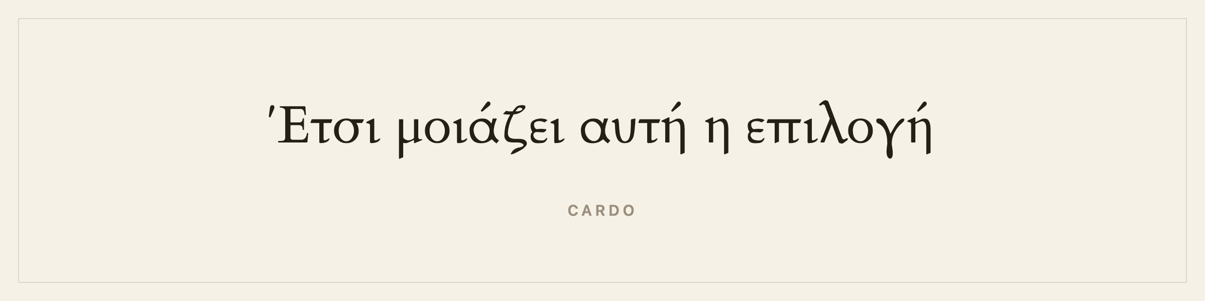
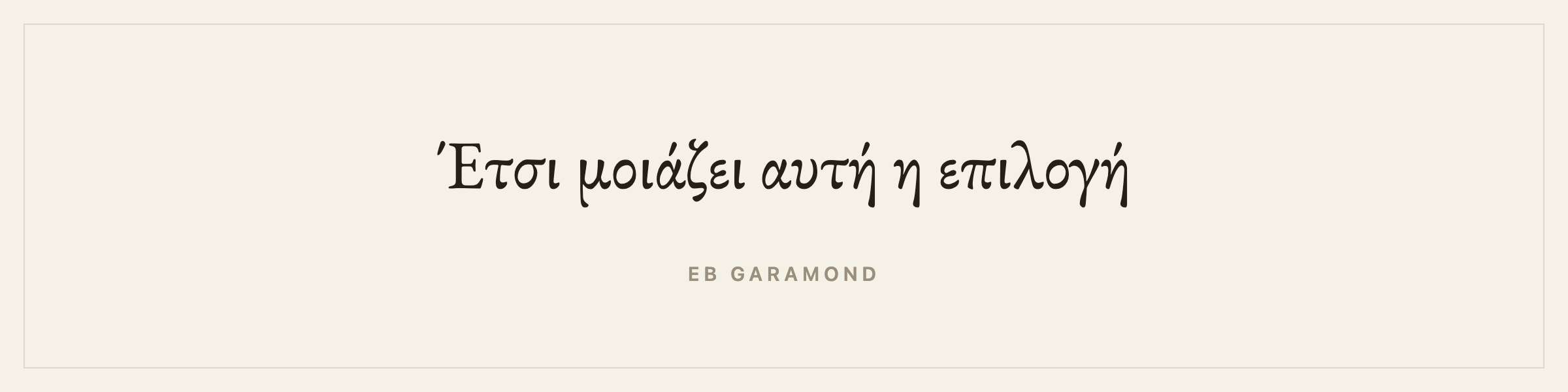
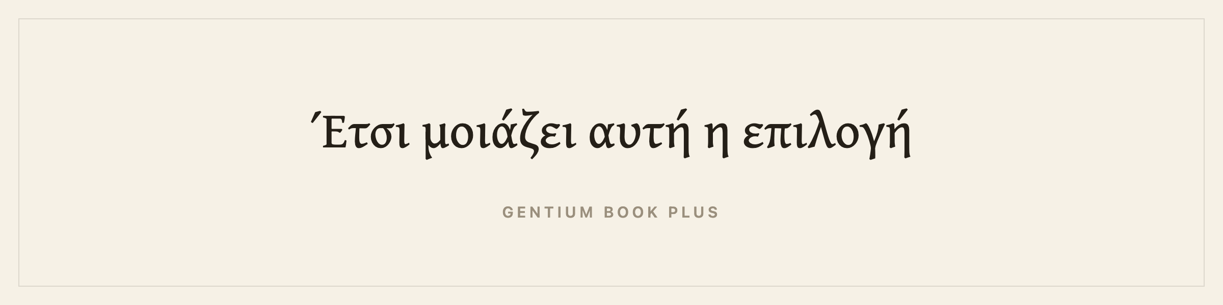
Be careful with any tool that claims Greek support. A lot of Latin fonts carry a handful of Greek letters because they double as mathematical symbols, alpha, omega, pi, delta, and carry nothing else. That is enough to pass a lazy check and nowhere near enough to set a book. Galley tests coverage against a full alphabet for this reason.
What you will not find here: Monotype Greek and the Linotype Greek families. Greek is better served than most, because the Greek Font Society releases serious free revivals and Cardo’s polytonic work came out of classical scholarship rather than a marketing brief.
Write your book in Vietnamese
Vietnamese uses the Latin alphabet with stacked diacritics, a tone mark on top of a vowel that already has a mark. That stacking is where fonts fail. Twelve of the fifteen Latin faces carry the full Vietnamese set.
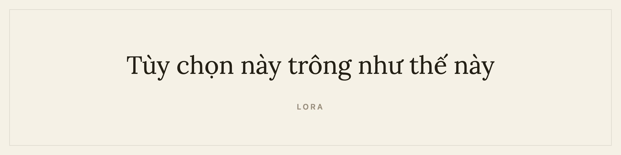
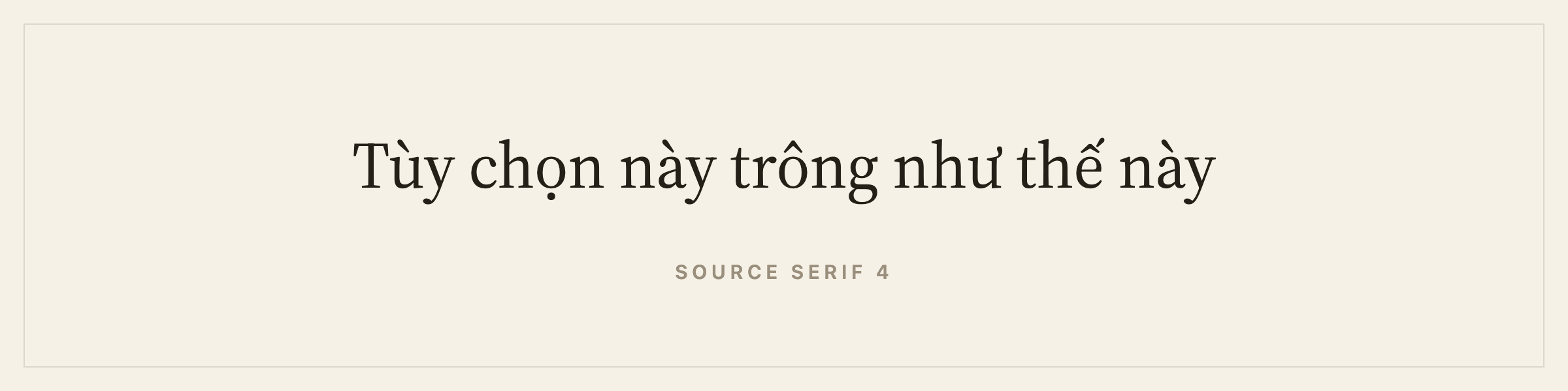
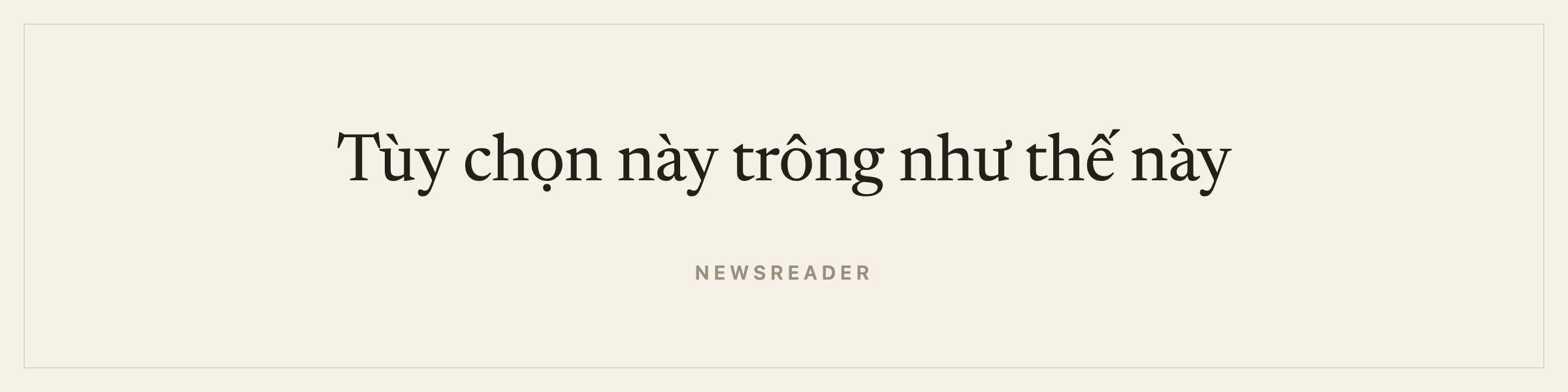
Vietnamese has no hyphenation patterns in Galley, so justify with care or set it ragged right.
Vietnamese is the one script on this page with no gap worth naming. It sets in Latin type, and the faces above are the same ones a Vietnamese publisher would choose, provided they carry the stacked diacritics.
Translations, editions and localisation
Two words get confused here and the difference matters.
Localisation is translating the software. Galley’s own interface is in English and stays in English. I am one person and a half-translated interface is worse than an English one.
Translation is your book, and that is what Galley is built for. A translation is a real book in its own right: its own language, its own ISBN, its own cover, its own blurb, its own typeface shelf chosen by its own language. It stays linked to the original so your dashboard does not turn into a list of near-duplicates, and it opens in a side-by-side view with the original read-only on the left.
The practical consequence is that translating your English novel into Arabic does not mean fighting a tool that thinks every book is the English one. The Arabic edition gets Amiri, gets tagged as Arabic in the EPUB, and gets no hyphenation, because none of that is right for Arabic.
Where to go next
- Book design and typefaces lists every face by language, with the reasoning.
- Series and translations covers the full language list and the side-by-side view.
- The typography rules that make a book look professionally made is the Latin-script version of this argument.
- EPUB vs print PDF explains why the EPUB handles some of this for free and the PDF never can.
More on design
- The Typography Rules That Make a Book Look Professionally MadeWidows, orphans, rivers, hyphenation, and the small typesetting conventions readers never notice but always feel, and why they separate a real book from a Word export.