The Best Fonts for a Novel Interior, and the Licence You Need
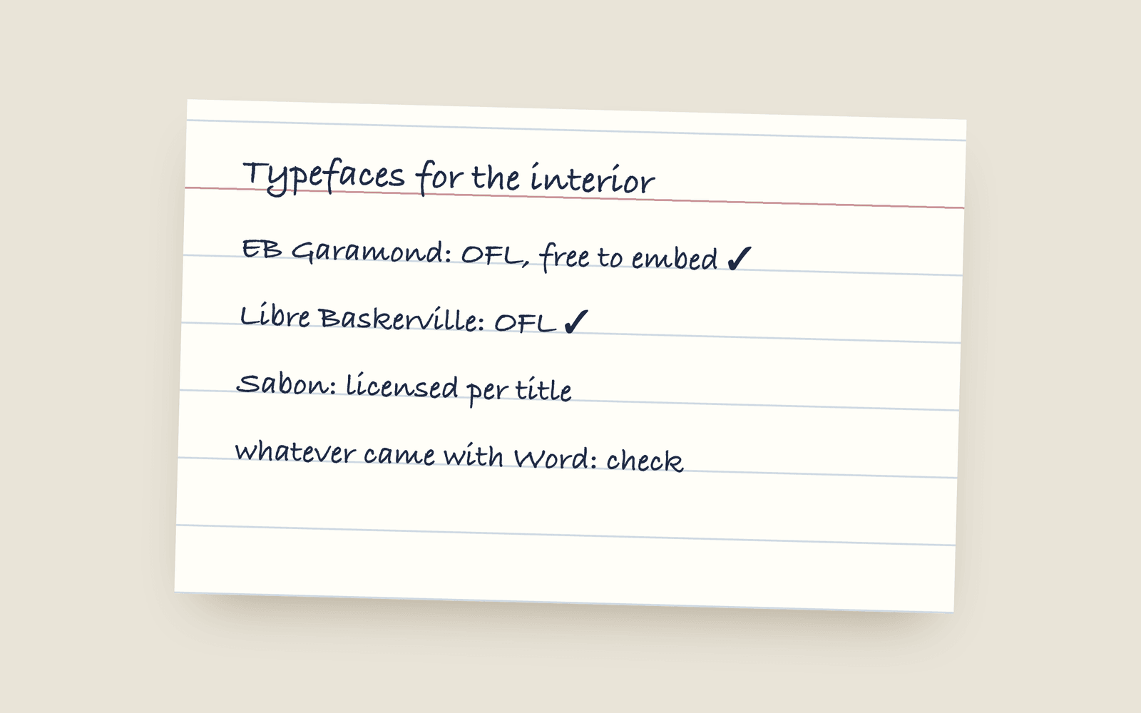
Most novels are set in an old-style serif like Garamond, Caslon, Baskerville, Sabon or Minion. The ones publishers use are mostly commercial fonts licensed per title. A font installed on your computer usually isn't licensed for embedding in a PDF or ebook you sell, so check. Open Font License faces like EB Garamond, Libre Caslon and Crimson Pro are free to embed and look the part.
If you look at the copyright page of a traditionally published novel, there’s sometimes a line at the bottom saying what it’s set in. “Set in Sabon.” “Typeset in Adobe Garamond Pro.” “The text of this book is set in Baskerville.” It’s the same dozen faces over and over, because they’ve been proven over hundreds of years to be comfortable for 300 pages.
What novels are set in
| Typeface | What it’s like | Free open-licensed version |
|---|---|---|
| Garamond (many versions) | The classic. Elegant, a little delicate. | EB Garamond |
| Caslon | Sturdy, very English, slightly old-fashioned. | Libre Caslon Text |
| Baskerville | Crisper and more formal than Garamond. | Libre Baskerville |
| Bembo | Renaissance, warm, often used for literary fiction. | Cardo (close, not a copy) |
| Sabon | A 1960s Garamond. Very common in UK publishing. | None that’s close |
| Minion | Adobe’s workhorse. Neutral and easy to read. | Crimson Pro, which is in the same spirit |
The modern faces drawn for long reading are worth a look too. Literata was made for Google Play Books, Newsreader for long articles on screen and in print, and both set a novel well.
What you want for body text is a serif with an even colour on the page (no letters that jump out), a decent italic (you’ll use it more than you think), and proper figures and punctuation. Avoid anything that’s mostly used for headings. Cormorant, for example, is lovely at 30 points and too thin at 11.
The licence is the part people skip
A font file installed on your computer comes with a licence, and most desktop licences let you print documents with it. They usually don’t let you embed it, which is what happens when you make a PDF for a printer or an EPUB for a store. The font travels inside your file, and to the font’s owner that’s distribution.
Commercial foundries sell separate licences for this. Some charge per title, some per print run, some by the number of ebook copies. Sabon, Bembo, Minion and Adobe Garamond all fall into this. If you’re publishing with a big house, they’ve already paid. If you’re self-publishing, you’re the publisher, so it’s your problem.
The way round it is fonts under the SIL Open Font License, which lets you embed them in anything you sell, no fee and no paperwork. Most of the good free revivals use it.
A few other things to check:
- Fonts that came with Word or macOS are licensed for use on that machine. Some allow embedding for print, most say nothing clear about ebooks. Read the licence or skip them.
- “Free for personal use” means not for a book you sell.
- Google Fonts are almost all OFL or Apache licensed, so they’re fine. Check the licence on the font’s page anyway.
How Galley does it
Galley has 35 book typefaces, 15 of them for Latin-script languages, and every one is under the Open Font License, so you can sell a book set in any of them. The ones I’d point a novelist at first are EB Garamond, Crimson Pro, Libre Baskerville and Lora, and the full list (with what each one is a revival of) is in the book design docs.
The face you write in is the face the book prints in, and it’s embedded in the print PDF and the EPUB when you export. If your book is in Arabic, Japanese, Hindi or another script, you only see the faces that can set it, and writing in your own language has that list by script.
More on design
- Drop Caps and Small Caps: How a Chapter Opens in a Printed NovelThe ways a novel's chapter can open: no indent, a drop cap, the first words in small capitals, and the conventions that make each one look right.
- Writing Software for Novelists Who Don't Write in EnglishHow to write and typeset a book in Arabic, Persian, Urdu, Hebrew, Hindi, Bengali, Thai, Japanese, Chinese, Korean, Russian, Greek or Vietnamese, which typeface each script gets, and what still needs building.
- Justified or Ragged Right for a Novel?Whether to justify the text of a printed novel, why justified text needs hyphenation, and when a ragged right edge is the better choice.