Drop Caps and Small Caps: How a Chapter Opens in a Printed Novel
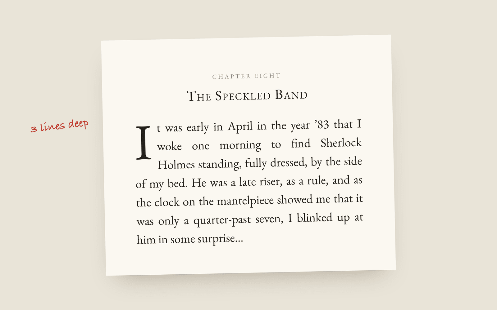
The first paragraph of a chapter is never indented. After that, a printed novel usually does one of three things: nothing, a drop cap (a large first letter sunk two or three lines into the text), or the first few words in small capitals. Small capitals are not the same as shrunk capital letters, and an opening quote mark goes with the drop cap, not on its own.
A chapter opening is the one place in a novel where the typesetting is allowed to show off a bit. Everywhere else the job is to get out of the way. On the first page of a chapter, the reader has just turned over from a blank space and it’s fine to mark the moment.
There are only a few ways to do it, and they all start from the same rule.
The first paragraph isn’t indented
Every paragraph in a novel is indented except the first one in a chapter, and the first one after a scene break. The indent is there to separate a paragraph from the one before it. The first paragraph has nothing before it, so it starts flush left.
This is the most common mistake in self-formatted books, and it’s easy to spot once you know it. Pull any traditionally published novel off the shelf and check.
Option one: nothing
Just the chapter title, some space, and the first paragraph flush left. Lots of literary fiction does this. It’s not lazy, it’s a choice, and it looks good in a book with a strong typeface and generous margins.
Option two: a drop cap
A drop cap is a large first letter sunk into the first few lines of the paragraph, with the text running round it. Two or three lines deep is normal for a novel. Any deeper and it starts to look like a children’s book or a medieval manuscript.
What makes a drop cap look right:
- The top lines up. The top of the big letter sits level with the tops of the capitals in the first line, and its baseline sits on the baseline of the last line it drops through.
- The quote mark goes with it. If the chapter opens on dialogue (“Quite so,” he answered…), the opening quote mark drops with the letter. Leaving it at body size in front of a huge Q looks broken.
- Watch letters with tails. A Q or a J hangs below its baseline, so the text has to run round it for one more line.
- One word after it in small caps, or none. Some books set the rest of the first word, or the first line, in small capitals after the drop cap. It’s optional.
Option three: small capitals
The other classic opening sets the first few words (often the first line) in small capitals: TO SHERLOCK HOLMES SHE is always the woman. It’s quieter than a drop cap and works in almost any genre.
Real small capitals are capital letters drawn at about the height of a lowercase x, with strokes as thick as the rest of the text. Shrinking normal capitals to 70% in Word gives you letters that look thin and pale next to the text around them, which is why typesetters care about the difference. The small caps glossary entry has a bit more on that.
How Galley does it
There are two settings that work together, both in book design. Chapter openings decides what sits above the text: a small-caps title, an ornament, “CHAPTER ONE”, or a combination. First line of each chapter decides how the paragraph starts: plain, a small caps opener (the first four words), or a drop cap three lines deep.
In the print PDF the drop cap is sized so its top meets the capitals of the first line and its foot sits on the third baseline, an opening quote mark drops with the letter, and a Q or J gets an extra line of room. Italics in the opening paragraph stay italic. The first paragraph is always set flush left, and so is the first one after a scene break.
Japanese, Chinese and Korean books don’t get drop caps or small caps at all, because a dropped Han character reads like a display error and those scripts have no lowercase to make small capitals from. The chapter opener and drop cap entries in the glossary cover the terms, and the typography basics post covers the rest of the page.
More on design
- Writing Software for Novelists Who Don't Write in EnglishHow to write and typeset a book in Arabic, Persian, Urdu, Hebrew, Hindi, Bengali, Thai, Japanese, Chinese, Korean, Russian, Greek or Vietnamese, which typeface each script gets, and what still needs building.
- The Best Fonts for a Novel Interior, and the Licence You NeedWhich typefaces novels are actually set in, the free open-licensed revivals of them, and why a font you own on your computer may not be licensed for your book.
- Justified or Ragged Right for a Novel?Whether to justify the text of a printed novel, why justified text needs hyphenation, and when a ragged right edge is the better choice.