What Is a Dinkus? Scene Breaks in a Printed Novel
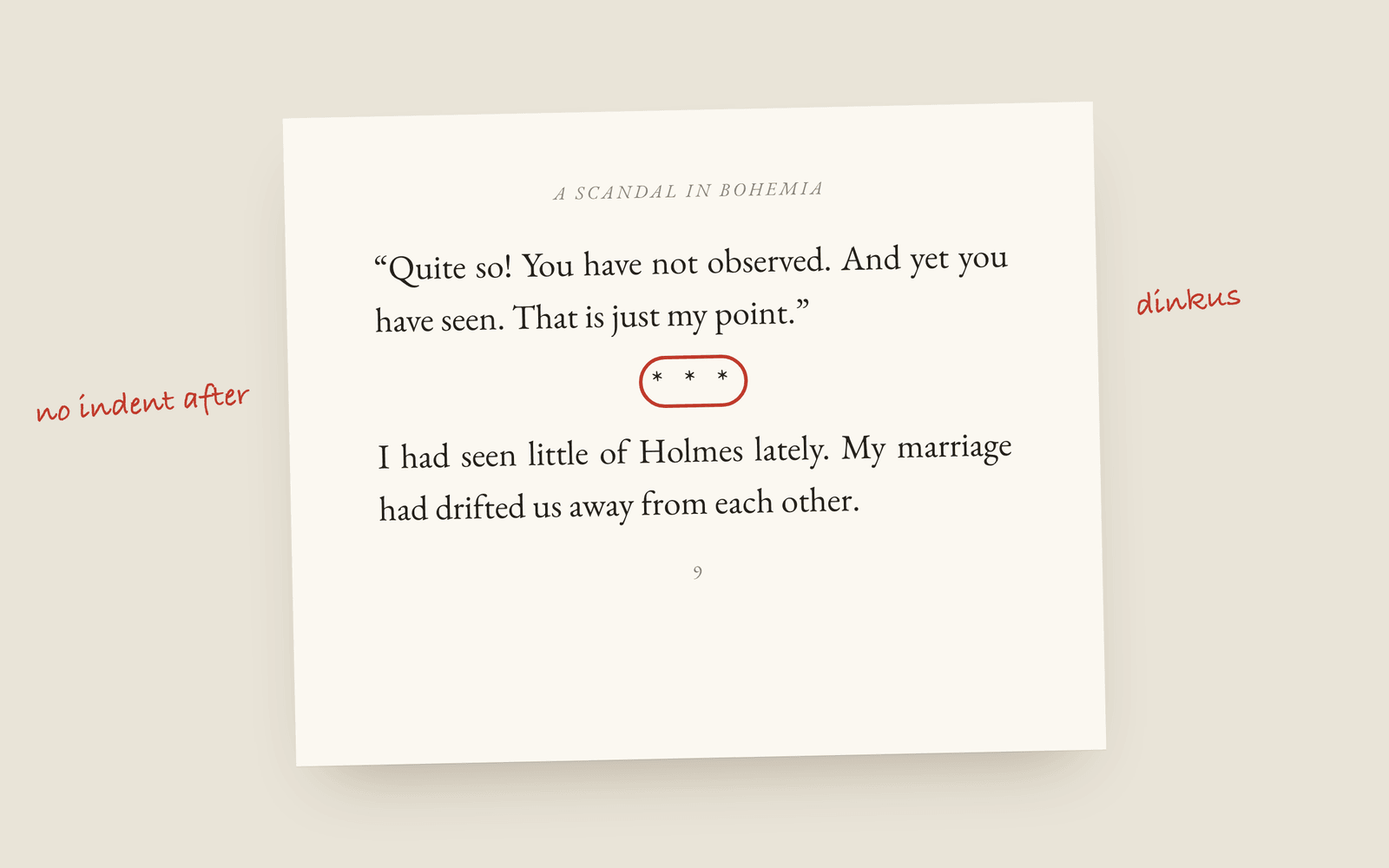
A dinkus is the row of three spaced asterisks (* * *) that marks a scene break. Novels also use an asterism (⁂), a small ornament or a plain blank line. The blank line is the risky one in print, because when it lands at the foot of a page the reader can't see it, so pick a mark you can see if the book is going to paper.
A dinkus is the little row of three asterisks you see between two scenes in a novel: * * *. It’s one of those words that sounds made up, and then turns out to be the only name anybody has for the thing.
It does one job. It tells the reader that time has jumped, or the point of view has changed, or we’re somewhere else now, without starting a new chapter.
The marks novels use
There are really only four, and you’ll have seen all of them:
| Mark | Looks like | Where you see it |
|---|---|---|
| Dinkus | * * * | Most commercial fiction. The safe choice. |
| Asterism | ⁂ | Older books, and some literary presses that like the look. |
| Ornament | a small flourish or fleuron | Fantasy, historical fiction, anything with a designed interior. |
| Blank line | (nothing) | Literary fiction, where the designer wants the page to stay clean. |
A short centred rule is a fifth option some designers use, and it reads like a dinkus with fewer opinions.
The Adventures of Sherlock Holmes, for what it’s worth, doesn’t use any of them. “A Scandal in Bohemia” is split into three numbered parts, I, II and III, which is what a magazine story did in 1891. A novel today would usually do the same job with a dinkus.
The problem with a blank line
A blank line works fine in the middle of a page. The trouble is when the break falls at the very bottom of a page, or the very top. The reader turns over, sees the next scene start, and has no way of knowing there was a break at all. Two scenes run together, and somebody on Goodreads says the transitions were confusing.
Typesetters handle this by putting a visible mark in whenever a blank-line break lands on a page edge. If you’re laying out a book by hand in Word, you have to check every one of them after the final page count settles, and again whenever anything moves. Which is a good reason to pick a dinkus or an ornament for print and save the blank line for the ebook, where pages don’t have edges in the same way.
The small rules
- No indent after a break. The first paragraph after a scene break starts flush left, the same as the first paragraph of a chapter. Everything after it is indented as normal. There’s more on that in the typography basics post.
- Centre the mark. On the text block, not the page, so it lines up with the prose.
- One style per book. Mixing a dinkus in chapter three with an ornament in chapter nine looks like two people typeset it.
- In a manuscript, use a hash. Agents and editors expect a single centred
#in standard manuscript format, not your designed ornament.
How Galley does it
In Galley you type three dashes (---) on their own line and the editor turns them into a scene break. How that break looks is a setting for the whole book: three asterisks, an asterism, a short rule or a blank line, and you can upload your own image if you have an ornament you want to use instead. Change it once and every break in the book changes with it, in the editor, the print PDF and the EPUB. The book design docs have the full list.
The first paragraph after the break is set flush left for you, and the manuscript export swaps whatever you picked for the plain # agents ask for.
The print PDF also never leaves a break stranded at the foot of a page. It keeps the mark together with at least two lines of the next scene, and if that pushes the break over a page turn, the mark goes at the top of the new page. If you chose a blank-line break, that one is printed as three asterisks, because white space at the top of a page reads as nothing.
If you want the definitions without the opinions, the glossary has dinkus and scene break as their own entries.
More on formatting
- Running Heads and Folios: The Top and Bottom of a Book PageWhat goes in the running head of a novel, where the page numbers sit, and the pages that should carry neither.
- Book Margins and the Gutter: The Numbers for KDPKDP's minimum margins by page count, why the inside margin (the gutter) has to grow as a book gets thicker, and what margins a novel should actually use.
- How to Choose a Trim Size for Your NovelWhat trim size means, the standard sizes for fiction (5×8, 5.5×8.5, 6×9 and the UK B-format), and how to pick the one that suits your genre and page count.